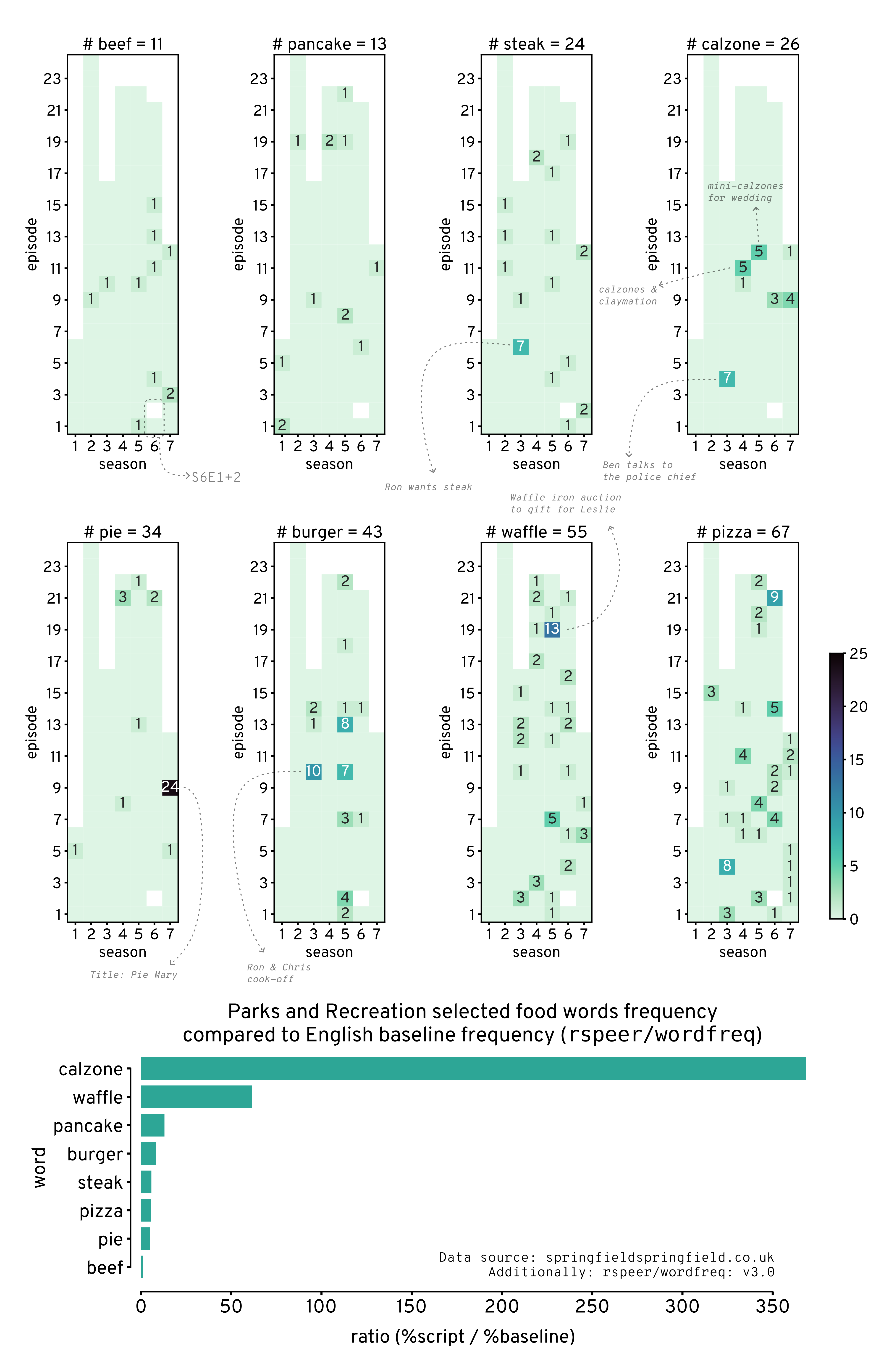
“Parks and Recreations” selected food words
This notebook visualizes selected food words from the TV show “Parks and Recreations”.
Source code: https://
Motivation
Why? Cuz the calzones ...
Well, some foods are unusually used more than normal in the show, calzones being of them (from Ben), and of course waffles from Leslie.
This manually selects the following words to count from the show transcripts:
calzone
pancake
waffle
pizza
steak
beef
burger
pie
You could already guess that calzone & pizza were chosen because of Ben, pancake & waffle cuz of Leslie and steak & beef cuz of Ron
Obtain data
The data file parks-and-recreation_scripts.csv was obtained using sf2 that downloaded the scripts from Springfield! Springfield!.
sf2 --show "parks-and-recreation" --format csvImport modules
Source
import re

import numpy as np
import pandas as pd

import matplotlib.pyplot as plt
from matplotlib import rcParams
import seaborn as sns

from wordfreq import word_frequency
from statsmodels.stats.proportion import proportions_ztest
Source
# plot configs
rcParams['font.family'] = 'Overpass Nerd Font'
rcParams['font.size'] = 18
rcParams['axes.titlesize'] = 20
rcParams['axes.labelsize'] = 18
rcParams['axes.linewidth'] = 1.5
rcParams['lines.linewidth'] = 1.5
rcParams['lines.markersize'] = 20
rcParams['patch.linewidth'] = 1.5
rcParams['xtick.labelsize'] = 18
rcParams['ytick.labelsize'] = 18
rcParams['xtick.major.width'] = 2
rcParams['xtick.minor.width'] = 2
rcParams['ytick.major.width'] = 2
rcParams['ytick.minor.width'] = 2
rcParams['savefig.dpi'] = 300
rcParams['savefig.transparent'] = False
rcParams['savefig.facecolor'] = 'white'
rcParams['savefig.format'] = 'svg'
rcParams['savefig.pad_inches'] = 0.5
rcParams['savefig.bbox'] = 'tight'
Load scripts & count words
data_path = 'parks-and-recreation_scripts.csv'words = [
'calzone', 'pancake', 'waffle', 'pizza',
'steak', 'beef', 'burger', 'pie',
]Count words from data
Source
def count_words(df, words):
    script = re.sub('[^A-Za-z0-9]+', ' ', df['script']).lower()
    df['total_count'] = len(script.split())
    script = script.split('\n')
    num_lines = len(script)
    df['norm_lino'] = np.arange(num_lines)/num_lines

    for w in words:
        out_w = np.full(num_lines, fill_value=0)
        for lino, line in enumerate(script):
            out_w[lino] = len([x for x in line.split() if x==w or x==w+'s'])
        df[w + '_series'] = out_w
        df[w + '_count'] = sum(out_w)

    return df
script_df = pd.read_csv(data_path, index_col=None)
script_df = script_df.apply(lambda df: count_words(df, words), axis=1)script_dfCompare data frequency to rspeer/wordfreq
This attemps to establish how uncommon these selected words are
The base frequencies are from using rspeer/wordfreq.
Higher ratios between script_freq and base_freq means such words are unusually higher than expected.
No additional comparisons or corrections are done, so take these numbers with a grain of salt.
Source
script_word_count = script_df.filter(regex='.*count').rename(columns=lambda c: c.replace('_count', '')).sum(axis=0)
total_word_count = script_word_count.pop('total')
script_word_freq = script_word_count / total_word_count

word_freq_df = pd.DataFrame({
    'script_freq': script_word_freq,
    'base_freq': {w: word_frequency(w, 'en') for w in words},
    'script_count': script_word_count,
})

word_freq_df['ratio'] = word_freq_df['script_freq'] / word_freq_df['base_freq']
word_freq_df['log_ratio'] = np.log10(word_freq_df['ratio'])

word_freq_df = word_freq_df.join(pd.json_normalize(word_freq_df.apply(
    lambda x: dict(zip(
        ('z_stat','p_val'),
        proportions_ztest(x['script_count'], total_word_count, x['base_freq'], alternative='larger')
    )),
    axis=1
)).set_index(word_freq_df.index))

word_freq_df = word_freq_df.reset_index().rename(columns={'index': 'word'})
word_freq_df = word_freq_df.sort_values(by=['ratio'], ascending=[False]).reset_index(drop=True)word_freq_dfVisualize results
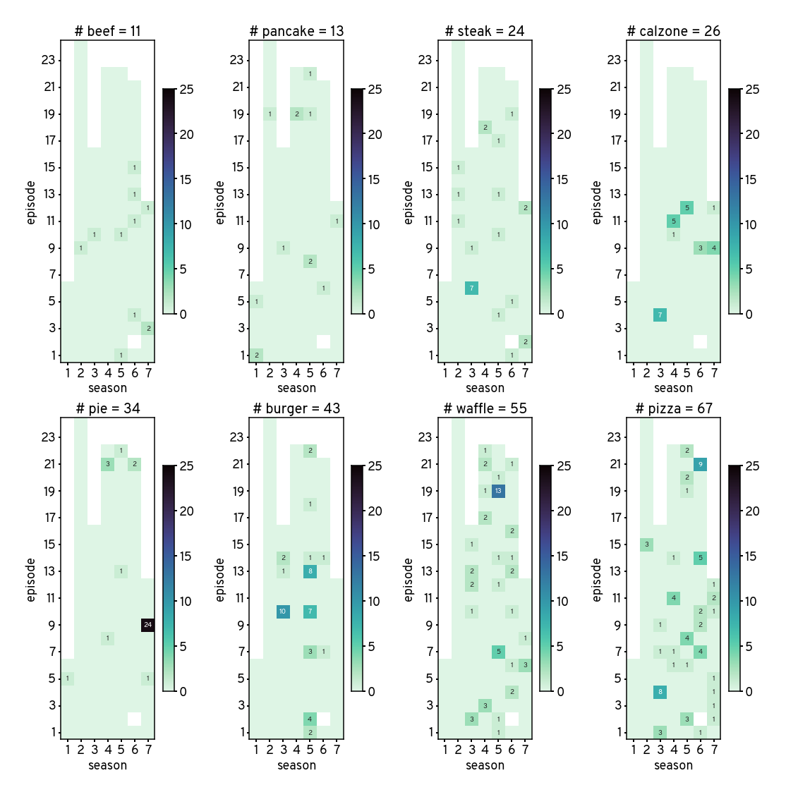
Counts of words throughout the show
Source
plt.figure(figsize=(15,15))

num_words = len(words)
sel_words = word_freq_df.sort_values('script_count').word.to_list()

for i, w in enumerate(sel_words):
    w_df = script_df.pivot(
        index='episode',
        columns='season',
        values=w + '_count'
    )
    w_total = np.nansum(w_df.to_numpy())
    plt.subplot(2,4,i+1)

    sns.heatmap(
        w_df,
        square=True,
        cmap='mako_r',
        vmin = 0,
        vmax = 25,
        fmt = 's',
        annot = w_df.fillna(0).astype(int).replace(0, '').astype(str),
        cbar_kws={'shrink':0.7}
    )
    plt.title(f'# {w} = {int(w_total)}')
    plt.gca().invert_yaxis()
    plt.yticks(rotation=0)

sns.despine(right=False, top=False)

plt.tight_layout()

# plt.savefig('figures/word_cnt_mat.svg')
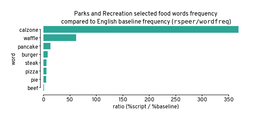
How are these words?
Remember higher means more unusually high, e.g. calzone was used about 350 times more frequently than expected.
Anyone who has watched the show can atest to this lol.
Source
plt.figure(figsize=(12,4))
sns.barplot(
    data=word_freq_df,
    y='word',
    x='ratio',
    color=(0,0.7,0.61),
    alpha=0.9,
    errorbar=None,
)
plt.xlabel('ratio (%script / %baseline)')
plt.title('Parks and Recreation selected food words frequency\n'\
          'compared to English baseline frequency ($\mathtt{rspeer/wordfreq}$)')
sns.despine(trim=True, ax=plt.gca(), offset=10)

# plt.savefig('figures/compared_to_baseline.svg')
Putting it all together w/ annotations
I put those 2 figures together in Inkscape with some annotations for the final presentatiton
from IPython.display import Image, display
display(Image(filename='figures/pandr-foods.png'))